
.jpeg)
Gone are the days when having a mobile-ready website was an option. Today it is a necessity. With a majority of Americans now owning Internet-accessible tablets, cell phones or other mobile devices, more and more people are using these devices for the majority of their online surfing. According to Elliot Lewis, managing director of Altringham-based agency, No Two the Same, “Mobile-savvy consumers now account for 20% of all traffic on the web and are increasingly less-forgiving of a poor mobile experience.” If your business’s website is difficult to navigate, view, or order from by those who are using mobile devices, your conversion rate will plummet.
One of the best methods for making websites compatible with mobile devices is what is referred to as “responsive design.” Responsive design websites enable mobile users to navigate, resize, scroll and navigate through the site more easily. It works because it adapts the website to the type of device on which the site is being viewed, thus eliminating the need to make a different version of the website for each kind of device (Apple, Android, Blackberry, etc.) that is out there.
Kayla Knight of Smashing Magazinewrites, “The practice consists of a mix of flexible grids and layouts, images and intelligent use of CSS media queries. As the user switches from their laptop to iPad, the website should automatically switch to accommodate for resolution, image size and scripting abilities.” Basically, the website uses technology to adapt to the device that is being used.
Google will soon be taking mobile-friendliness into account when ranking websites. Beginning April 21st of this year, Google’s new ranking algorithm will benefit sites that are mobile-ready. In his article Is Your Website Ready to Google’s Big Mobile Update, Adam Dince of Deluxe.com writes, “When our websites aren’t easy to use on mobile devices, we send a message to people that we don’t care about their visits.” He adds that “Mobile must now be a priority for all businesses.”
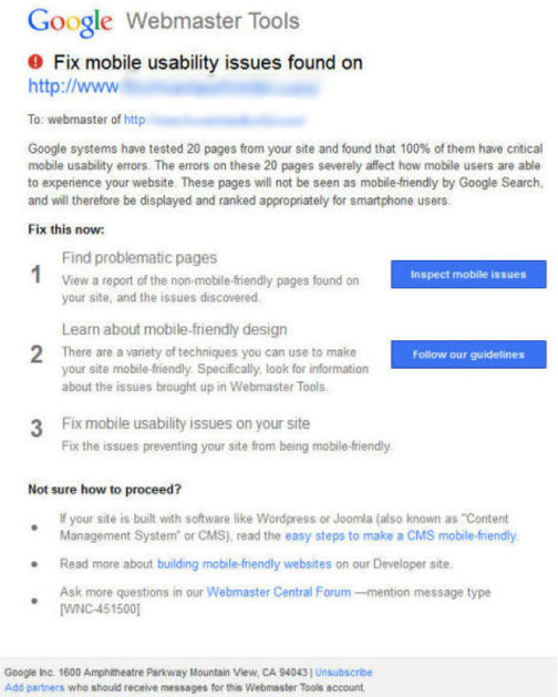
So, how do you know if your site is mobile-ready? The good news is that Google’s Webmaster Tools Team is being pro-active by warning website owners whose sites do not meet mobile-readiness standards. An example of an email sent to one company can be seen below.
There is no reason to keep your eyes peeled for an email though. Google makes it very easy to check your site on your own. Simply visit their Mobile-Friendly Test site, enter your URL and find out if it is or is not mobile ready. If it is not, this site will show you the reasons why it failed when displaying the test results. Some of the most common reasons your site may fail the test include, but are not limited to:
Some of the listed reasons for failing the mobile-friendly test may be easy enough to fix. Others, however, might prove overwhelming. If you are unable to make the necessary changes on your own, you may want to invest in the services of a company that can handle the mobile-readiness issue for you.
Up until very recently, the issue of mobile-readiness was a non-issue. However, it has grown increasingly important for customer satisfaction and can now affect your Google rankings. It is therefore too important to ignore. Is your site mobile-ready? If not, how are you planning to remedy that? Share your thoughts in the comments.
Our customers value boutique agency approach with access to a seasoned team, profit-based goals, and clear communication.


